Home › FX Trading School › Beginner
How to Read a Forex Price Chart (Beginner Guide)
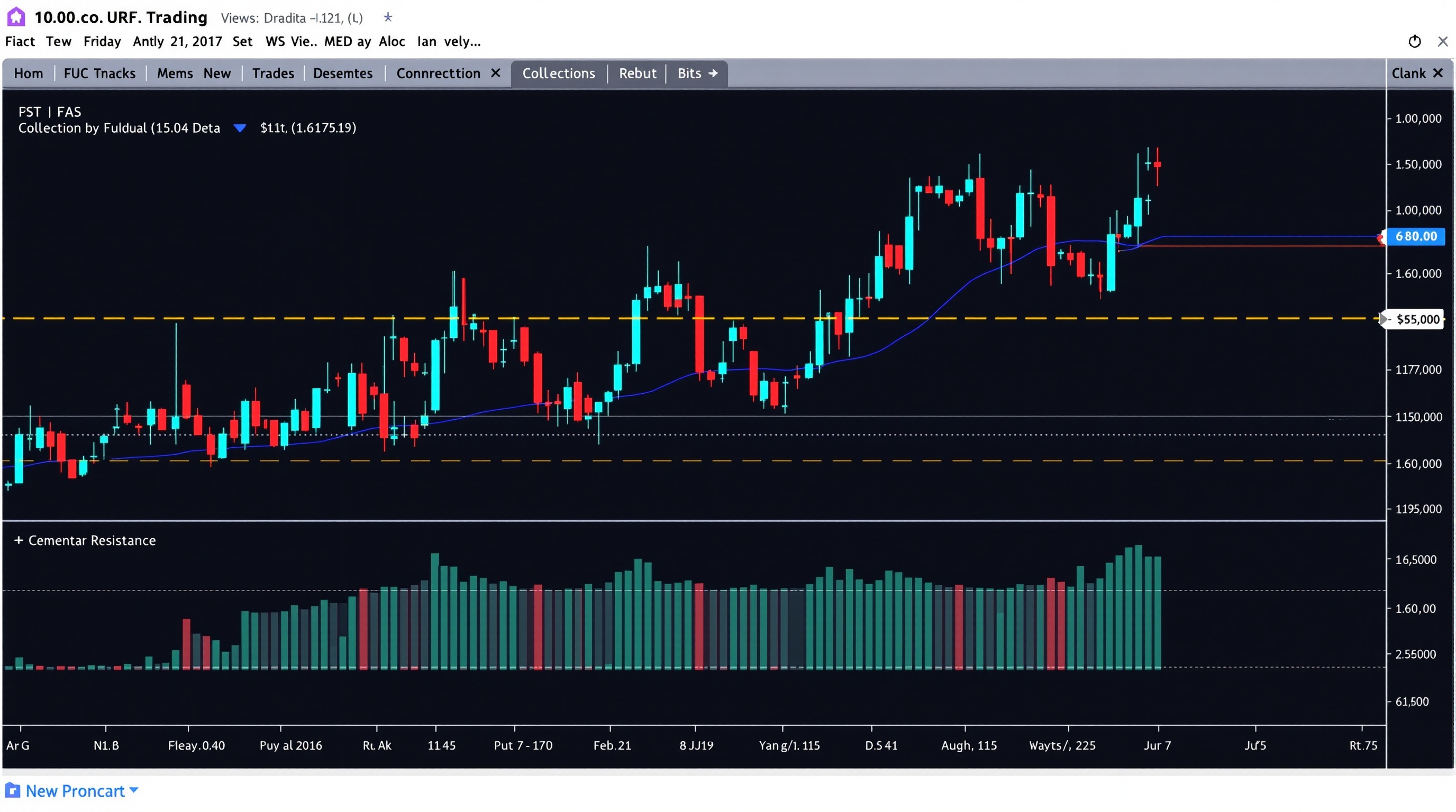
Learning how to read a forex price chart is the single most useful skill you'll build early in this course — everything else, from spotting a trend to placing an order, depends on being able to look at a chart and understand what it's telling you. This lesson assumes you've already worked through Module 1's introduction to pips and quotes; here we build directly on that by turning raw price quotes into a visual story you can actually use.
What a Forex Chart Actually Shows
A forex chart is simply a plot of price against time for one currency pair. Every point on the chart represents an actual exchange rate that existed at that moment — for example, how many US dollars one euro would buy.
Charts are built from a stream of quotes, and platforms group those quotes into fixed time periods called candles or bars. Whether you're looking at a chart on Pepperstone's MetaTrader 4/5 platform or on IG's own web platform, the underlying idea is identical:
- X-axis (horizontal) — time, moving left to right
- Y-axis (vertical) — price, usually quoted to the pair's standard decimal places
- Each candle/bar — a snapshot of price action over one period (1 minute, 1 hour, 1 day, etc.)
Zoom out far enough and you see months of history; zoom in and you see individual minutes. The chart itself doesn't change — only how much of it you're looking at, and how coarse each candle is.
Understanding Candlesticks
Candlesticks are the most widely used way to display forex price data because they pack four pieces of information into one shape:
- Open — the price at the start of that period
- Close — the price at the end of that period
- High — the highest price traded during the period
- Low — the lowest price traded during the period
The thick part is the body (open to close), and the thin lines above and below are the wicks or shadows (high and low). Colour tells you direction at a glance:
| Candle colour | Meaning | |---|---| | Green/blue (bullish) | Close was higher than open — buyers had control | | Red (bearish) | Close was lower than open — sellers had control |
A long wick with a small body often shows rejection — price pushed one way then got pulled back, which some traders read as a sign of hesitation at that level. Don't over-interpret single candles though; context from the surrounding chart matters far more than any one shape.
Timeframes: Why the Same Pair Can Look Different
One of the most confusing things for beginners is that GBP/USD can look like a strong uptrend on the daily chart and a choppy mess on the 5-minute chart — both at the exact same moment. Neither view is "wrong"; they're just answering different questions.
- Higher timeframes (daily, 4-hour) — show the bigger picture, filter out noise, useful for understanding the dominant trend
- Lower timeframes (15-minute, 5-minute, 1-minute) — show fine detail, useful for timing entries, but far noisier
As a beginner, pick one primary timeframe to learn on — many traders start with the 1-hour or 4-hour chart — and get comfortable reading it fully before jumping between timeframes. Constantly switching timeframes looking for a chart that "agrees" with what you want to see is a common early mistake.
Support, Resistance and Market Structure
Support and resistance are the zones where price has previously struggled to break through:
- Support — a level below current price where buying pressure has previously stepped in
- Resistance — a level above current price where selling pressure has previously stepped in
Draw these as zones, not razor-thin lines — price rarely reacts at an exact number, and forcing precision onto a naturally imprecise thing leads to frustration. Look left on the chart for areas where price has reversed more than once; those are your candidates.
Market structure also includes swing highs and swing lows — the peaks and troughs that form as price moves. A series of higher swing highs and higher swing lows suggests an uptrend; lower highs and lower lows suggest a downtrend. This is the raw material trend lines are built from.
Drawing Trend Lines Properly
A trend line connects a series of swing highs (in a downtrend) or swing lows (in an uptrend) to visualise the direction of the market.
Guidelines for drawing them sensibly:
1. Use at least two touch points to draw the line, and treat a third touch as confirmation 2. Connect wicks or bodies consistently — pick one approach and stick to it across your chart 3. Don't force a line to fit — if you need to bend the rules to make a trend line "work," it probably isn't a valid one 4. Re-draw as new data arrives — trend lines are not permanent; markets evolve and old lines can become irrelevant
A broken trend line doesn't automatically mean a reversal — it often just means the pace of the move has changed. Treat trend lines as a guide to context, not a signal on their own.
Putting It Together: A Simple Reading Routine
When you open a chart — whether on Pepperstone's MT4/MT5 charting or IG's platform — try running through the same short checklist every time:
1. What timeframe am I on, and does it match my plan? 2. What's the recent swing structure — higher highs/lows, or lower highs/lows? 3. Where's the nearest support and resistance zone relative to current price? 4. Is there a trend line, and has it recently been tested or broken? 5. What do the last few candles look like — strong momentum, or indecision (small bodies, long wicks)?
Doing this consistently, on the same pair, at the same time each day, builds pattern recognition far faster than jumping between charts randomly.
Chart Reading Alone Isn't Enough
Being able to read a forex price chart tells you about market structure and possible reaction points — it says nothing about your actual trading costs, which quietly erode results over time. Spreads, commissions and swaps vary by broker and account type, and they matter just as much as your chart analysis.
Before you size up any strategy based on chart reading:
- Check current live costs for your instrument and account type using PipTax's [cost tool](/audit.html)
- Compare broker structures on the [broker pages](/brokers/index.html) — Pepperstone and IG both publish their account types clearly, but the numbers change, so always check live
- Understand our methodology for how we compare costs on the [methodology page](/methodology.html)
Learning how to read a forex price chart is a genuine skill and worth practising daily — but pair it with honest cost awareness and sound risk management. Move on to the next lesson in [Module 2](/school/index.html) once you're comfortable identifying candles, timeframes, support/resistance and trend structure on a chart of your choice.
Key takeaways
- A forex price chart shows the history of buying and selling pressure between two currencies, plotted as price against time
- Candlesticks give you four prices per period — open, high, low, close — and their colour tells you whether that period closed up or down
- Timeframe changes the story: the same pair can look bullish on a 5-minute chart and bearish on a daily chart, so pick one primary timeframe and stick to it
- Support and resistance are zones, not exact lines, where price has previously struggled to move past
- Trend lines and swing highs/lows help you judge the direction of the market before you consider any trade
- Chart reading tells you where price might react — it doesn't tell you your real cost of trading, which is why you still need the cost tool at /audit.html before entering
Frequently asked questions
- What's the best timeframe for a beginner to start with?
- There's no single 'best' timeframe, but most beginners find the 1-hour or 4-hour chart easier to read than very short timeframes like 1-minute. These slower charts have less noise, giving you more time to think before making a decision. Once you're comfortable reading structure on a slower chart, you can experiment with faster ones.
- Do I need candlesticks, or can I use a line chart?
- A line chart (usually plotting the close price) is fine for spotting the broad trend quickly, but it hides a lot of information. Candlesticks show you the open, high, low and close for each period, which reveals things like rejection wicks and indecision that a line chart simply can't show.
- Why does the same currency pair look different on Pepperstone's MetaTrader platform versus IG's own platform?
- Different platforms can plot slightly different prices because each broker feeds its own pricing from its own liquidity sources, and charting settings (candle colours, gridlines, session times) vary too. The overall shape of the chart should be similar, but don't expect pixel-perfect matches between, say, Pepperstone's MT4/MT5 server and IG's native platform.
- How many indicators should I add to my chart as a beginner?
- As few as possible at first. Learn to read raw price action — candles, support/resistance, trend — before adding indicators. Many experienced traders run charts with only price and maybe one or two tools like a moving average. Cluttered charts often confuse decision-making rather than improve it.
- Does reading charts well guarantee profitable trades?
- No. Chart reading helps you understand market structure and possible reaction points, but it says nothing about position sizing, costs, or risk management. Most retail forex accounts lose money, and chart skills alone won't change that without a sound overall trading plan.