Home › FX Trading School › Intermediate
Chart Patterns: Triangles, Flags and Wedges
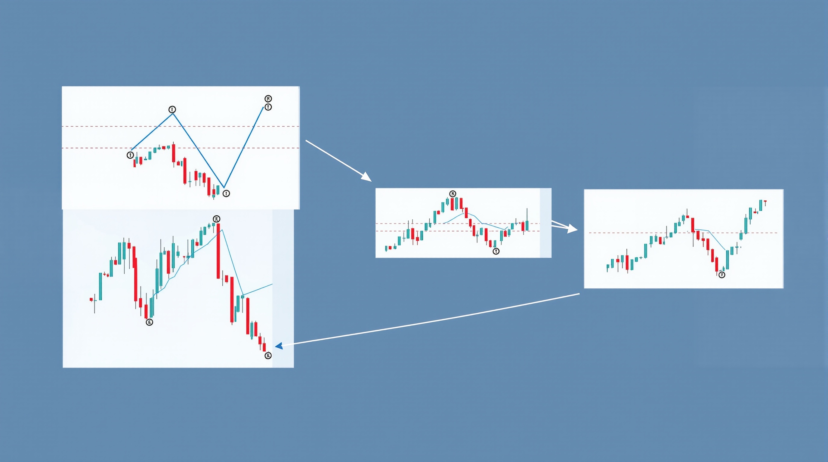
Chart patterns like triangles, flags and wedges are simply repeatable shapes that price tends to carve out as buyers and sellers fight for control, and learning to spot them properly is a natural next step once you're comfortable reading support and resistance. This lesson builds on that earlier module — if you haven't nailed drawing clean horizontal levels and trendlines yet, go back to that lesson first, because everything here depends on it.
We'll keep this practical: what each pattern looks like, what it tends to mean, and how to avoid the classic beginner mistake of seeing a "perfect" triangle on every chart you look at.
What Chart Patterns Actually Tell You
Before naming shapes, it helps to understand what's really happening. Every chart pattern is a visual summary of supply and demand at specific price levels over time. When price keeps testing a level and getting rejected, that's resistance. When it keeps finding buyers, that's support. Triangles, flags and wedges are just support and resistance lines drawn at an angle instead of flat, showing that the balance of power is shifting gradually rather than staying static.
A few grounding points before we go further:
- Patterns describe consolidation — a pause in the trend, not a guarantee of what happens next.
- Context is everything — the same triangle shape can be a continuation in one market and a reversal in another.
- Confirmation matters more than the shape itself — a textbook-looking pattern that never breaks out with conviction is worth nothing.
- These are probability tools, not certainties — trading is risky, and most retail traders lose money, so treat every pattern as one piece of evidence, not a signal to bet the account on.
With that mindset, let's look at the three shapes.
Triangles: Symmetrical, Ascending and Descending
Triangles form when price makes lower highs and higher lows (or one flat side and one sloped side), squeezing into a narrowing range before breaking out.
- Symmetrical triangle — both trendlines converge, one falling and one rising. Direction of breakout is genuinely uncertain until it happens; this is the most neutral of the three.
- Ascending triangle — a flat resistance line on top with rising higher lows underneath. Generally seen as bullish, since buyers are willing to pay more each time, though flat resistance can still hold.
- Descending triangle — a flat support line underneath with lower highs above. Generally seen as bearish for the mirror-image reason.
In practice, on a Pepperstone MetaTrader chart or IG's own charting platform, you'll draw two trendlines connecting the swing highs and swing lows as they compress. The pattern is "confirmed" only once a candle closes beyond one of those lines — not just wicks through it. Many traders also check that the breakout candle shows real momentum, not a half-hearted push.
Common mistake: forcing a triangle onto a chart that's really just choppy, directionless price. If you have to squint to see the converging lines, it probably isn't a clean triangle.
Flags and Pennants: Pauses Inside a Strong Move
Flags and pennants both follow a sharp, strong move — the flagpole — and represent a brief rest before the trend likely continues.
- Flag — price consolidates in a small parallel channel, tilted slightly against the prior move (e.g. drifting down after a strong rally).
- Pennant — the same idea but the consolidation converges to a small triangle rather than a parallel channel.
Both are considered continuation patterns, meaning the expected resolution is in the same direction as the flagpole. A bull flag after a strong rally is expected to break upward; a bear flag after a sharp drop is expected to break downward.
Key things to check:
1. Size and speed of the flagpole — a weak, slow move rarely produces a reliable flag. 2. Duration of the consolidation — flags that drag on too long start to lose their statistical edge and can morph into something else entirely. 3. Volume/momentum on breakout — a genuine continuation usually comes with renewed conviction, not a limp push through the line.
Flags tend to be short-lived, which makes them popular on intraday charts — but shorter timeframes also mean spread and commission costs matter proportionally more to your result, which is worth checking on PipTax's cost tool before trading them actively.
Wedges: When the Shape Slopes Against the Trend
Wedges look similar to triangles — two converging trendlines — but both lines slope in the *same* direction, and that direction runs against the prevailing trend.
- Rising wedge — both trendlines slope upward, but the pattern typically appears after an uptrend and is read as a warning of exhaustion, often resolving downward.
- Falling wedge — both trendlines slope downward, typically appearing after a downtrend, often resolving upward.
The logic: price is still grinding in the "expected" direction, but each new swing is smaller than the last, showing weakening momentum even as the trend limps onward. That fading conviction is what makes wedges a more reversal-leaning pattern than triangles or flags.
| Pattern | Typical bias | Lines | Usual context | |---|---|---|---| | Symmetrical triangle | Neutral until breakout | Converging, opposite slopes | Mid-trend pause | | Ascending/descending triangle | Leans with the flat side | One flat, one sloped | Mid-trend pause | | Flag/pennant | Continuation | Parallel (flag) or converging (pennant) | After a sharp flagpole move | | Rising/falling wedge | Reversal-leaning | Converging, same slope direction | End of a trend |
As with everything in this lesson, treat these labels as tendencies, not rules carved in stone.
Trading Chart Patterns Without Getting Caught Out
Spotting the shape is the easy part. Trading it sensibly is harder. A workable checklist:
- Confirm with a closed candle beyond the pattern's boundary — not just an intrabar wick.
- Check the higher timeframe trend — a bullish continuation pattern fighting against a strong daily downtrend is a weaker bet.
- Consider waiting for a retest of the broken trendline as new support/resistance before entering, which can improve entry price at the cost of sometimes missing the move.
- Always use a stop-loss — patterns fail, often abruptly, and false breakouts are common, especially around news events.
- Size positions sensibly — no chart pattern justifies risking more than you can afford to lose.
It's also worth remembering that pattern-based breakout trades are sensitive to execution quality: slippage on a fast breakout candle, or a wide spread at the moment you enter, can turn a technically correct call into a losing trade. Compare execution and cost conditions across regulated brokers such as Pepperstone and IG using the cost tool, and read the methodology behind those comparisons so you understand exactly what's being measured.
Chart Patterns in Context: The Bigger Picture
Chart patterns aren't a standalone strategy — they're a layer that sits on top of the trend analysis and support/resistance work from earlier in this course. A triangle breaking out in the direction of a clear higher-timeframe trend carries more weight than the same shape appearing in a directionless, choppy market. Flags earn their reputation precisely because they follow a strong, clean flagpole move; without that, the "flag" is just noise.
The honest takeaway: these chart patterns give you a structured, repeatable way to read pauses and continuations in price, but they don't remove the uncertainty that comes with trading. Combine them with solid risk management, realistic position sizing, and an awareness of what execution actually costs you on a given broker, and you'll be using chart patterns the way experienced price action traders actually do — as one tool among several, not a crystal ball.
Next lesson in Module 7 builds on this by looking at how these patterns interact with key support and resistance zones for higher-probability setups.
Key takeaways
- Chart patterns are just visual shorthand for a battle between buyers and sellers that's already visible in support and resistance lines
- Triangles (symmetrical, ascending, descending) usually signal a pause before continuation, but they can also mark reversals — context matters more than the shape
- Flags and pennants are short, sharp pauses after a strong move ('the flagpole') and tend to resolve in the same direction as that move
- Wedges look like triangles but slope against the trend and more often warn of exhaustion and reversal
- None of these patterns work in isolation — always check the higher timeframe trend and wait for a confirmed breakout with follow-through
- Spreads and slippage around breakouts can quietly erode the edge these patterns offer, so check real costs before trading them live
Frequently asked questions
- Are chart patterns like triangles and flags reliable enough to trade on their own?
- No pattern works in isolation. Triangles, flags and wedges describe where price has been consolidating, not what it will definitely do next. Treat them as one input alongside the higher timeframe trend, support/resistance, and confirmation from a closed candle beyond the pattern boundary. Used alone, without risk management, they're just lines on a chart.
- What's the real difference between a flag and a wedge?
- A flag's two boundary lines are roughly parallel, like a small rectangle or channel tilted against the prior move. A wedge's lines converge to a point, like a narrowing triangle, and typically slopes against the broader trend. Flags mostly continue the trend; wedges more often signal exhaustion and a possible reversal.
- How do I know if a triangle breakout is real or a false break?
- Wait for a candle to close clearly outside the trendline, not just poke through it intrabar. Many traders also want to see increased volume or momentum on the breakout candle, and some wait for a retest of the broken line as new support or resistance before entering. Even then, false breaks happen, so a stop-loss is essential.
- Do these patterns work the same on every timeframe?
- The shapes appear on any timeframe, but reliability generally improves on higher timeframes (H4, daily) simply because there's more genuine buying and selling behind each swing. On very low timeframes (M1, M5) you'll see plenty of triangles and flags that are mostly noise and spread cost.
- Where can I check if spreads will eat into a breakout trade?
- Use PipTax's cost tool at /audit.html to compare live spread and commission costs across FCA-regulated brokers such as Pepperstone and IG for your instrument and account type before you commit to trading breakouts.